SnapPass
Leveraging Snapchat's fun ethos and brand identity, we designed a new feature within the app that enables low-income individuals to explore Culver City through a gamified scavenger hunt.

How might we create an interactive and affordable experience to highlight key features and landmarks to visitors of Downtown Culver City?
♦ Project managed a team of three designers to ensure a timely delivery of our product
♦ Designed our usability plan for workshops and user testing
♦ Wrote the script for our promotional video which walked through SnapPass' unique features and benefits
♦ Designed the initial user flow for our mobile application
22 year old Karina just graduated from Rutger's University with a degree in psychology. She just moved back home and is looking for a low cost way to enjoy Culver City. Dani sketched a story board to bring life to our proto-persona.

We created an empathy map for our target user to understand and empathize with their experiences, thoughts, and feelings.

Our team identified Downtown Culver City as the ideal location for our solution with its rich history, vibrant arts scene, and hidden gems which presented a compelling opportunity to develop our solution.
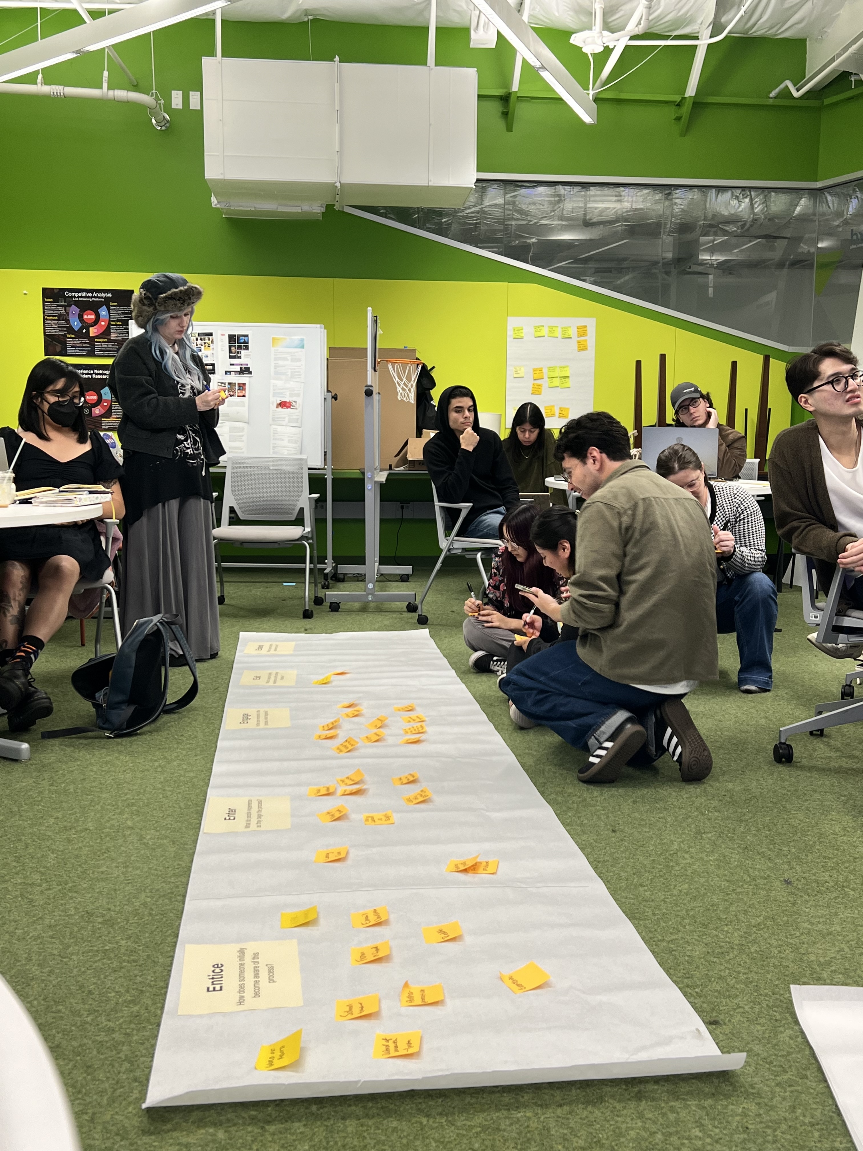
We conducted ethnography research on the ground. We broke down our observations into a couple of core categories to help guide our fieldwork.

We conducted two user interviews with our target audience. Both people were from LA and frequently visit Culver City. Our findings revealed that many recent graduates struggle with finding their community again after college, and the unaffordability of Culver City makes it difficult to participate in the community.

We used the Point of View (POV) framework to help distill our understanding of user needs from multiple perspectives.

We used this technique to outline the interactions that our target user has with our product. We wanted to identify pain points and opportunities for addressing these needs.

Our goal was to create an interactive and affordable experience that highlights key features and landmarks to visitors of Downtown Culver City. We came up with three pitch proposals for this idea: a VR tour guide, a gamified scavenger hunt, and an informational kiosk and pitched the idea to our professors. Based off of feedback we decided to go with the gamified scavenger hunt idea.
Once our pitch was approved, we began designing the SnapPass experience, continuously iterating based on insights gathered from our usability tests."
Angel sketched the first version of our proposed idea. We drew inspiration from games like animal crossing.

We created a digital scavenger hunt that fits perfectly into SnapChat's ecosystem. Through weekly challenges, users are able to learn about key landmarks and the rich history of Culver City. As a reward for their participation, users are offered a way to expereince the city in an affordable way.
To determine the necessary screens for the project, I started by mapping out an initial user flow. This helped us visualize the user journey and identify how a weekly mission can be completed.

After figuring out our user flow, Dani and Celia created a paper prototype. At the start of our design process, we wanted a fast, cost-effective way to communicate our ideas to stakeholders, focusing on the overall user experience rather than getting bogged down in details. Paper prototyping allowed us to quickly iterate on different design concepts, test key interactions, and gather immediate feedback—all while keeping the process highly collaborative and flexible. This approach also ensured we could make rapid adjustments before committing to more complex digital designs.

This is the “mission” tab. A mission consists of three challenges. Each challenge allows users to explore historical sites around Culver City.

The discover tab is the landing page for users. They are able to see all the stickers they have and the stories of other users.
We created another prototype based on the key takeaways from the first round of user testing. Using the same usability template from before, we facilitated a workshop and tested our mid-fidelity prototype on 10 people.


We created high fidelity prototypes based on our feedback after our second round of usability testing.


As we were designing, we wanted to create brand consistency for our application. Therefore, we created a style guide to clarify instances and make our application more cohesive. We also were very mindful of SnapChat's brand guidelines and used that as a basis for our application.

The tutorial explains the benefit of the game.Based on our research we wanted our design to emphasis three key things.
♦ Increase participation by introducing free rewards for playing
♦ Offer fun and engaging ways to explore Culver City
♦ Help promote Culver City through positive social media experiences

Users can complete weekly challenges on their own or with others. The missions are designing to help users explore more about Culver City's rich history.

After completing weekly challenges, users can earn a reward like a free drink from Philz Coffee. With Culver City's rising costs, this reward makes local experiences more accessible, encouraging users to explore and engage with the community.

Given the fact that SnapChat is a global company, we wanted to make sure that SnapPass has the potential to scale. Although our application was designed with a local perspective in mind, I can see how our idea could be re-done for other cities.
Testing and Feedback Loop
User testing, a crucial phase in the UX journey, provided valuable insights that sometimes challenged our initial assumptions. We initially assumed that users wouldn't want to post pictures to their story to complete a challenge, but through our research, we discovered that Snapchat is truly a platform for close friends and our gamified scavenger hunt works well with Snapchat's platform.
Embracing Constraints
We were constrained by SnapChat’s brand guidelines since we were building an application that would live inside of SnapChat’s ecosystem.
Personal Growth
Looking back at this project, I have grown immensely as a designer. I was able to gain valuable skills through conducting user testing workshops and prototyping in Figma. Finally, it was a joy working and learning from my friends.